
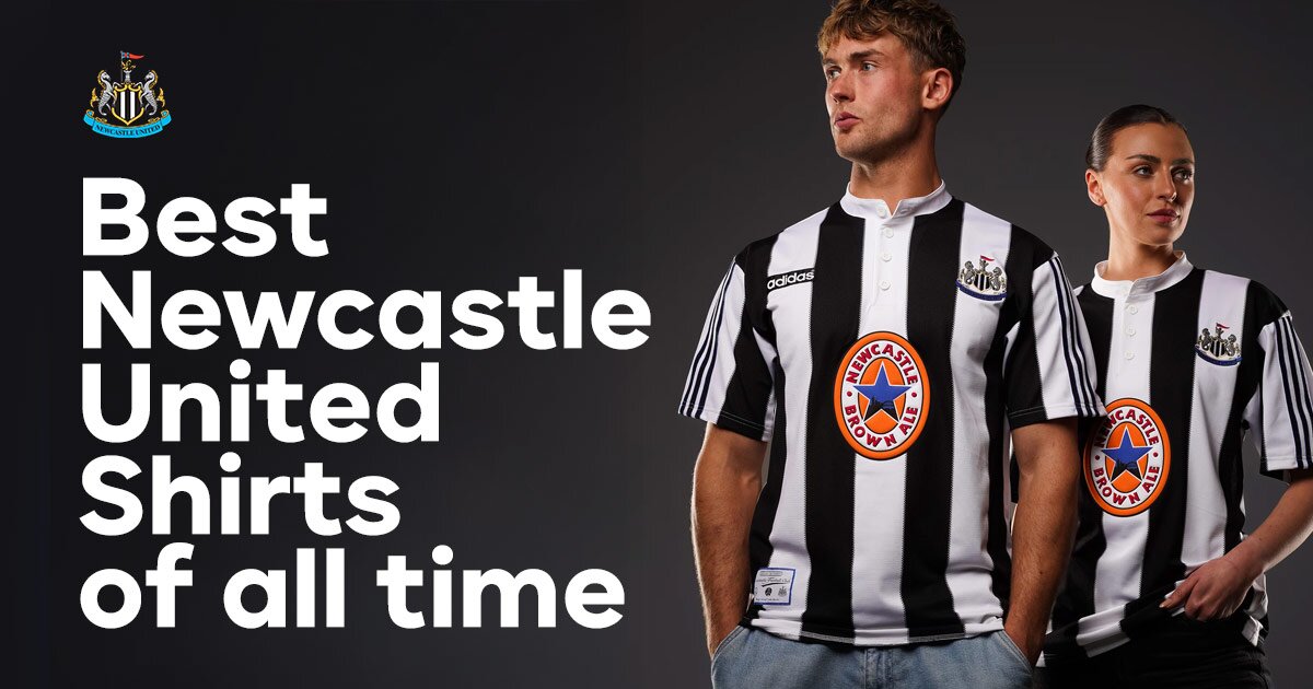
Best Newcastle United Shirts of all time
one year ago
Don’t you know, pump it up, Newcastle’s won the cup, so on and so forth.
Standing in the trophy parade recently, I was surrounded by a sea of black and white shirts, each one a testament to the club's rich history.
From the classics to the cult favourites, it got me thinking—it's about time I give you the top 10 Newcastle kits, in my fully unbiased opinion.
Whether it’s the nostalgia of the '90s or the timeless elegance of the stripes, these shirts tell stories of glory, heartbreak, and unforgettable moments.
So, without further ado, let’s dive into the best of the best…

Best Newcastle United Shirts
10) 2003-04 Away
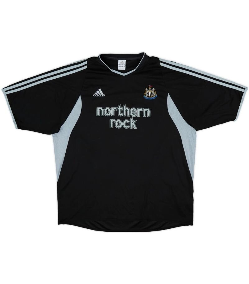
Image from Football Kit Archive
Black kits don’t get enough recognition in my eyes, and the 2003-04 Newcastle United away kit is a prime example of understated brilliance.
Sleek and sharp, there was something about seeing the Magpies turn up in all black that felt a bit rebellious. It just turned up, looked good, and got on with it. A proper cult classic.
Sure, the season had its ups and downs, but that kit? That was a winner every time it stepped onto the pitch.
9) 1980-83 Home

Image from Football Kit Archive
There’s just something magical about the 1980–83 Newcastle United home kit — a proper throwback to simpler, scrappier footballing days.
With its iconic black and white stripes, classic collar, and that glorious old club badge stitched proudly on the chest, it’s a shirt that oozes nostalgia.
Can’t help but love a shirt with the old badge—it's the kind of kit that makes you want to lace up your boots, throw on a pair of shin pads, and pretend you're taking on Sunderland in the pouring rain.
8) 1996-97 Away
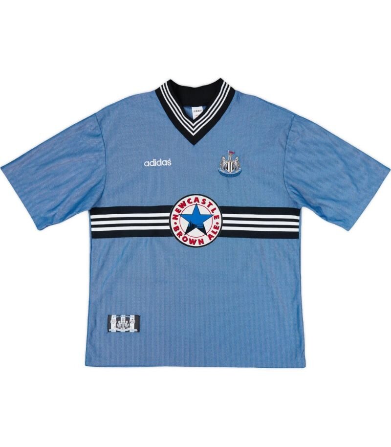
Image from Football Kit Archive
Ah, the 1996-97 Newcastle United away kit — what a masterpiece! This shirt is just iconic with its soft light blue colour, accented by those bold black and white stripes that scream '90s football fashion.
The classic Newcastle Brown Ale sponsor proudly sits across the chest, instantly transporting you back in time. Worn by legends like Shearer and Beardsley, this shirt wasn’t just about style; it was about swagger, too! It’s a true gem in the world of football kits.
I can’t help but be reminded of the 1996 England away kit too, another icon of English football.
7) 2017-18 Third
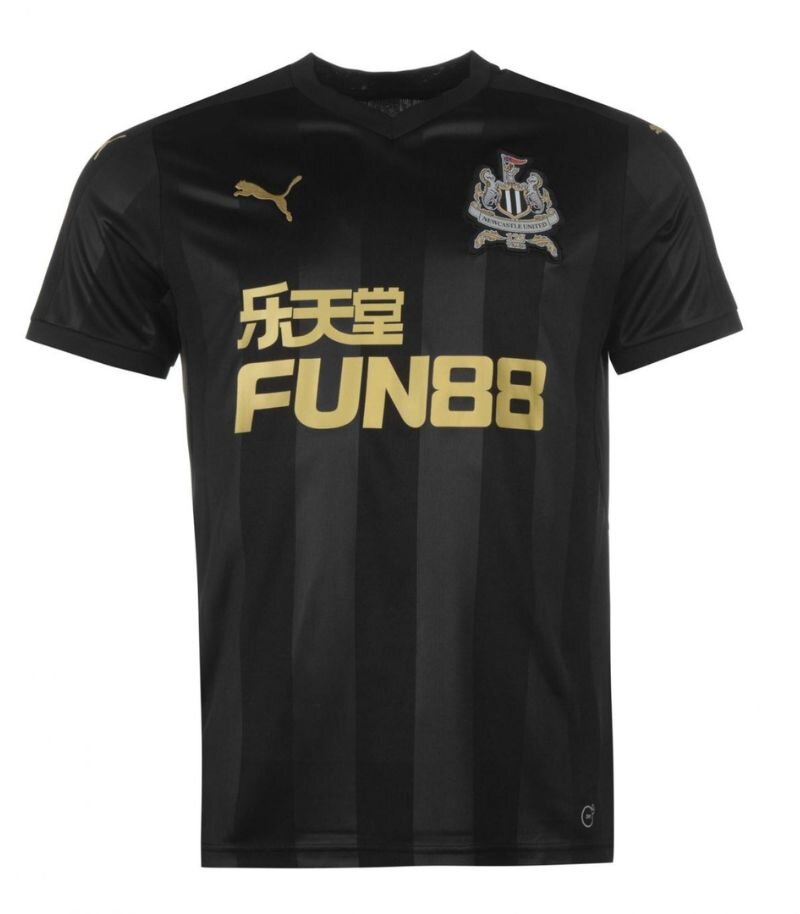
Image from Football Kit Archive
The 2017-18 Newcastle United third kit—a sleek all-black number that meant business.
With the iconic 125th anniversary crest stitched proudly on the chest in gold, it was a classy nod to the club’s storied past. PUMA’s goal was “to give both the players and fans confidence in style as they step out into their rival’s territory”, and this kit did just that.
Dark, bold, and full of attitude, it wasn’t just a strip—it was a statement. A stealthy reminder that the Magpies don’t need bright colours to shine.
6) 2007-09 Home
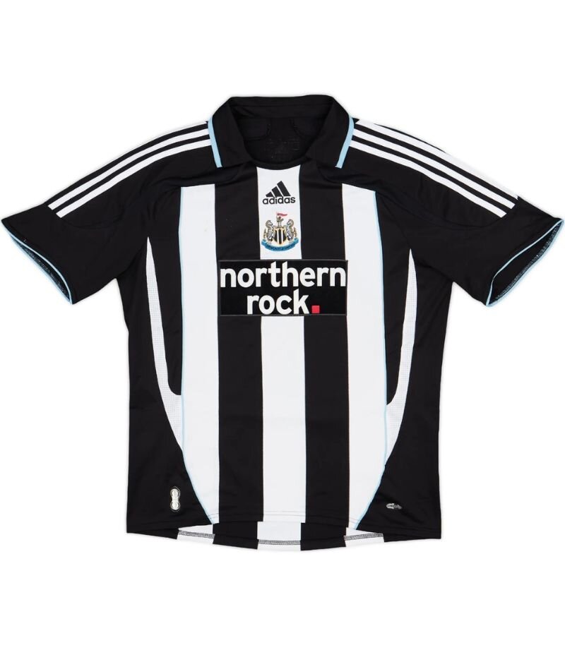
Image from Football Kit Archive
The 2007–09 Newcastle United home kit was a classic with a twist. While it stuck to the iconic black-and-white stripes, the real standout was the collar.
With its blue outline, it was way ahead of its time—subtle, yet stylish, like something you'd expect to see on a shirt in the years that followed, not back in 2007.
It gave the kit a touch of class and modern flair, making it not just a piece of football kit but a statement. It wasn’t just about scoring goals—it was about looking good while doing it.
5) 1997-99 Home
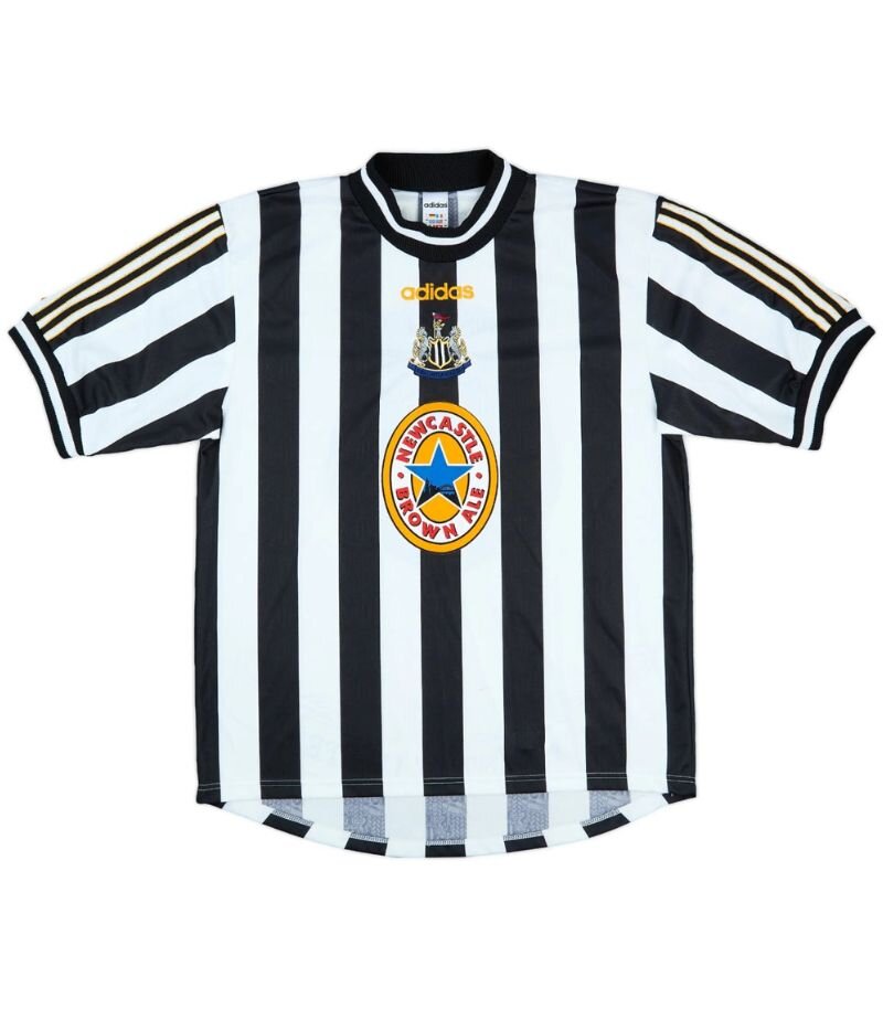
Image from Football Kit Archive
The 1997-99 Newcastle United home kit – what a classic! The iconic black and white stripes were sharp as ever, paired perfectly with the ever-familiar Newcastle Brown Ale sponsor that we all know and love.
But the real kicker? Those buttons – a unique touch that added a bit of class to the shirt. And then there was the badge – proudly positioned in the centre, adding to that old-school charm.
It’s funny, because now central badges are all the rage again, but back then, it was wow. It’s a shirt that takes you straight back to the golden days of the Premier League. A true gem!
4) 1995-96 Away

Image from Football Kit Archive
Ah, the 1996-97 Newcastle United away kit — now that was a beauty! This shirt is just iconic: that bold maroon and navy hooped design was like nothing else on the pitch.
It had a proper ‘90s swagger, and let’s not forget the classic sponsor slap bang in the middle — Newcastle Brown Ale, of course. With legends like Ginola sporting it, this kit wasn’t just memorable; it was downright majestic.
Fast forward to 2024, and the iconic design has been remade in an attempt to bring back those nostalgic vibes. While the updated version gives a nod to the original, there’s just something about the classic that can never be topped. After all, some things are just better left as they were—this kit is a timeless piece of Newcastle history!
3) 2024-25 Third
Image from Football Kit Archive
The 2024-25 Newcastle United third kit is a delightful throwback, drawing inspiration from the iconic 1990-00 away kit.
With its retro vibes, the shirt pays homage to the golden era of the club, featuring the retro 1983-1988 crest to complete the nostalgic look.
It’s more than just a kit – it’s a walk down memory lane, bringing together history and style in a bold, modern package. Perfect for fans who love to wear their history with pride!
2) 1999-00 Home
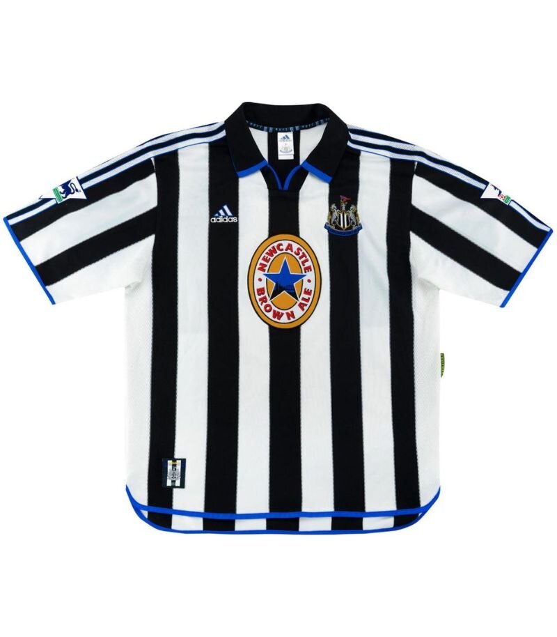
Image from Football Kit Archive
Ah, the 1999-2000 Newcastle United home kit – a true blast from the past! With its iconic black and white stripes and the unmistakable sponsor plastered across the chest, it’s a kit that still makes Geordie hearts beat faster.
The bold design, which stayed true to Newcastle’s traditional look, was a real crowd-pleaser – especially when the team was performing at its peak.
It’s one of those kits that oozes nostalgia for fans who remember the days of Alan Shearer’s clinical goals and the magnetic energy of St James' Park. A perfect mix of stylish simplicity and footballing history!
1) 1995-97 Home

Image from Football Kit Archive
The 1995-97 Newcastle United home kit is nothing short of iconic, and for good reason! It’s the shirt that perfectly captured the Geordie spirit of the mid-'90s—bold, brash, and unapologetically stylish.
The black-and-white stripes were as sharp as the club's attacking play, with the instantly recognisable Newcastle Brown Ale logo making its mark in the centre.
It wasn’t just a shirt; it was a symbol of a golden era for the club, featuring legends like Ferdinand and Ginola. Whether you were at St James’ Park or in front of the telly, this kit was a key part of the magical 'Entertainers' era, and it's still a fan favourite today. It just so happens that adidas have recently re-released the kit!
If Newcastle was recognised by one shirt, this would be it.
And that’s a wrap on my top 10 Newcastle United shirts – fully unbiased, of course!
From retro classics to modern masterpieces, each kit tells a little part of a story. Whether you’re a fan of the bold, the bizarre, or the beautifully simple, there’s something special about pulling on a shirt that connects you to the club’s history.
Cheers for joining me on this nostalgic stroll through the wardrobe – now go dig out your favourite and wear it with pride. Howay the lads!
Tagged in this article:

in
shirtsOnce a force to be reckoned with on the pitch, Tasha’s love for football spans over a decade—until her playing career was cut short by the classic knee injury story—a setback that shifted her focus but never dulled her love for the sport. She previously played for Carlisle City and Stanwix Ladies before swapping her boots for a whistle. Now an FA-qualified referee, she spends her time officiating for Newcastle United’s academy as well as your typical Sunday league, channelling her inner Anthony Taylor on weekends (but without the VAR controversies). Since joining the team in 2023, Tasha has crowned herself the resident expert on all things sport and fashion. Whether she's ranking questionable kits or offering insight into trending trainers, her observations are sharp, insightful, and on point. She's got a knack for finding the perfect blend of performance and style—just don’t ask her to pick a favourite Premier League kit of the season unless you're ready for a heated debate.


Brands
Help & Support
From The Blog
