
24 worst football kits of 2022/23
3 years ago
The world needs bad football shirts, just so we can appreciate all the good ones.
Since brands are becoming braver and bolder with their designs, it’s only natural that sometimes they'll get things very wrong indeed.
While we’ll always applaud an attempt to freshen things up, such experimentation can quickly lead to incredibly ugly (or downright hilarious) results.
Some shirts from this season have turned into masterpieces which constantly keep our bank accounts on their toes, while others are such spectacular fails they deserve their very own YouTube compilation. There’s a very fine line between the two.
We’re counting down the ugliest and worst football kits of 2022/23, from the brain-numbingly boring, to the bizarre and vomit-inducing.
Once you’ve got a sturdy sick bucket on standby, it’s time to take a deep breath and jump into the scariest of horror shows: the FOOTY.COM Hall Of Shame.
READ | Our ranking of every single Premier League shirt for 2022/23.
Doncaster Rovers Away

A kit reminiscent of those 10p hard-boiled lime and liqourice sweets and lets be honest, no one like liqourice.
- Rowan, FOOTY.COM
U.S. Cremonese Third

Well, this is wild. And there's far too much going on for the Serie B club. It's sort of retro, sort of futuristic, sort of rubbish.
- Kevan, FOOTY.COM
Australia Away

Achieves the impossible in that it features a kangaroo and an emu, yet is still incredibly boring.
- Adam, FOOTY.COM
Partick Thistle Special

Adding the club mascot to your kit is likely never a good idea. And this 'Kingsley' kit proves it, beyond reasonable doubt. It makes the players look like fanboys at a Pokémon convention and when coupled with the tartan shorts, it's just... wow.
- Kevan, FOOTY.COM
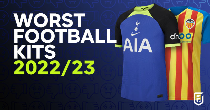
Tottenham Hotspur Away

Cheers Spurs, Son's crying. Tottenham marketed this monstrosity with the slogan "Dare To Do Bold". Maybe be a little more timid next time lads...
- Rowan, FOOTY.COM
RB Leipzig Home

Leipzig normally find themselves sitting pretty in our best shirt rankings. However, with this home offering they're treading in unfamiliar waters, or drowning. Yeah, definitely drowning.
- Rowan, FOOTY.COM
Valencia Third

Valencia with a hearty and nostalgic tribute to Refresher bars. Incredible colour theme for tasty, lemon flavoured confectionary. For a footy kit? Not so much.
- Andy, FOOTY.COM
Go Ahead Eagles Away

Navy and purple chequered squares, plain black collar, white cuffs on the sleeves. The stuff of nightmares.
- Adam, FOOTY.COM
READ | Our rundown of the best non-league kits of the season.
Leeds United Away

Never wash whites with colours, folks. Clearly Leeds didn't get the memo with this one.
- Rowan, FOOTY.COM
Iceland Home

We all know Iceland have one of the best badges in the game - it has a bull, a giant, a dragon and an eagle seamlessly woven through the design. But how do they represent that deep folklore and old Norse symbolism on a shirt? Well, they've bunged a rectangle on it. Nice.
- Andy, FOOTY.COM
Napoli Christmas Special

Well, that's Christmas ruined. Open this festive fiasco on Chrimbo morning and there'll be more tears than a family game of Monopoly after one too many glasses of fizz.
- Rowan, FOOTY.COM
Sint-Truiden Home

Pretty sure I played this level on Sonic the Hedgehog. Points for nostalgia, but retro arcade games have no place in modern shirt design.
- Adam, FOOTY.COM
St. Johnstone Away

Binn Group? This is firmly part of a 'get in the bin' group for me. Purple and teal with an overlay of fish scales. Sorry Saints, but this is far from heavenly.
- Kevan, FOOTY.COM
Brest Home

Talk about selling yourself to the highest bidder(s). This plain 'Sunday League' adidas teamwear shirt is needlessly overpowered by a ton of corporate sponsors. It's an eyesore!
- Kevan, FOOTY.COM
OGC Nice Third

This not so "nice" (sorry) kit would fit right at home in an episode of Changing Rooms, circa 2003. Whoever said orange and purple don't go was absolutely correct.
- Megan, FOOTY.COM
Everton Away

They say pink makes you wink. Was that a wink? Or are you just closing your eyes so you don't have to look at this Everton number any longer. We can't tell...
- Rowan, FOOTY.COM
READ | Our ranking of the best 2022/23 Championship home kits.
Maccabi Haifa Away

You couldn't choose a more perfect sponsor than Volvo. This shirt is so incredibly safe, grey and boring, that it's unable to bring us any joy at all. If you looked up 'functional' in the dictionary, this is what you'd see.
- Kevan, FOOTY.COM
Reading Home

Sorry Reading, you'll never get city status with a kit like this. A tiger never changes its stripes, but I sure hope Reading do before next season.
- Megan, FOOTY.COM
Switzerland Away

For me, this Puma template simply didn't work on any of the shirts it was slapped upon this season. The away Swiss example is probably the worst of the bunch.
- Kevan, FOOTY.COM
Eibar Third

This looks like the design team couldn't decide on green or yellow, so Frankenstein stitched the two together to create this monstrosity. No me gusta.
- Megan, FOOTY.COM
Fortaleza Special

Like the cover of French exercise book from the '90s. School exam flashbacks don't do it for us, guys.
- Adam, FOOTY.COM
Canada Away

Was this inspired by their homeland's vast tundra or did someone simply forget to save their design? You decide.
- Adam, FOOTY.COM
Levante Third

It's a bit like one of those cheap psychadelic 3D shirts from Wish, it just makes you feel a little queasy. Add in a badge colour clash, then it's a total disaster.
- Kevan, FOOTY.COM
Rochdale Away

The sponsor looks to have been involved, bringing an unwanted oil spill to the party. Splatter patterns don't always work and when it comes to yellow and black, even Borussia Dortmund didn't manage to pull it off.
- Kevan, FOOTY.COM
The above kits may be fairly ugly, but sometimes that's exactly why you should get hold of one! If you fancy making your collection a little more unique, then compare prices at FOOTY.COM to find the best deals on the internet. Oh and just so you know, we compare prices on beautiful shirts too.
Tagged in this article:

in
shirtsQuintessential grassroots journeyman. I've had more "you look like Gareth Barry" comments than I have career goals.


Brands
Help & Support
From The Blog
